


 Menu
Menu



Corab - visual identification and communication concept
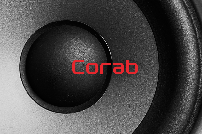
LogoThe Corab brand is well known both locally and across Poland, and the division responsible for distributing hi-fi equipment has been associated with quality and professionalism for years.
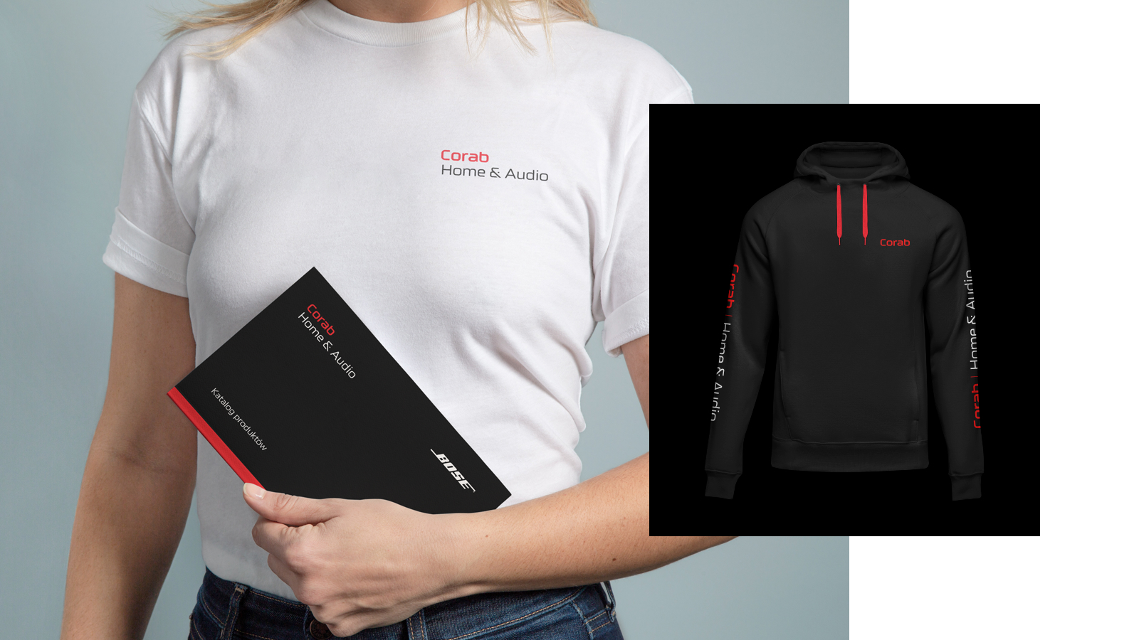
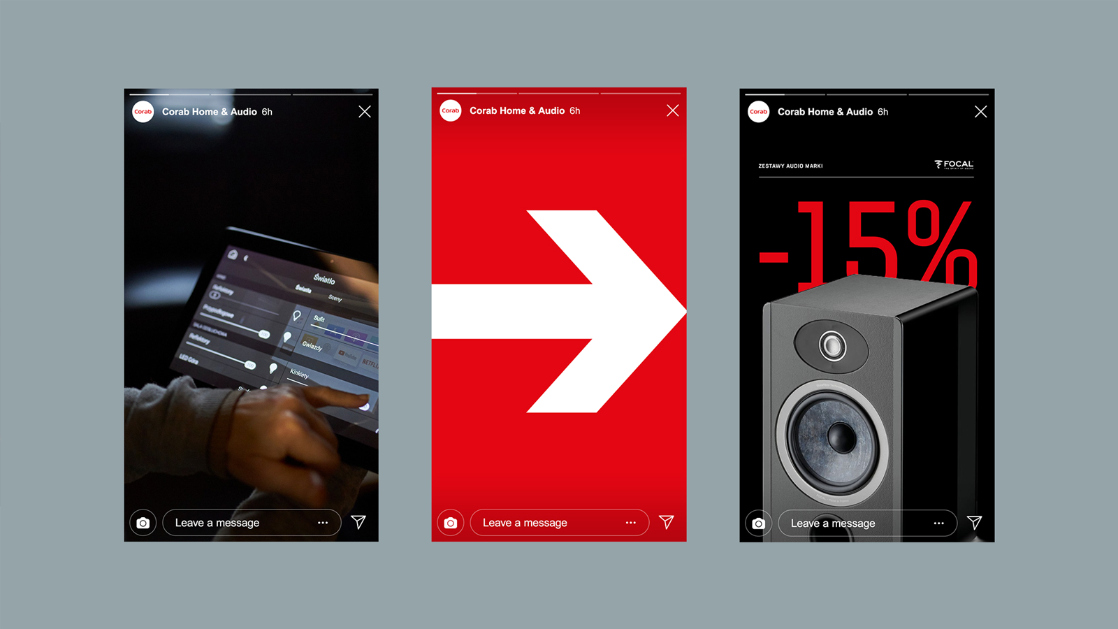
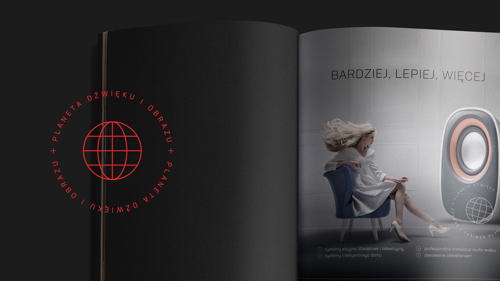
When we began working together, our task was to refresh the brand’s image while keeping the key elements that make it recognisable. We also paid particular attention to social media communication, which needed a more contemporary approach. Among other things, the work produced new visual details, including a suggestive set of icons.
The tasks were delivered smoothly and in full agreement, and a partnership that satisfies both sides continues today.
year: 2022


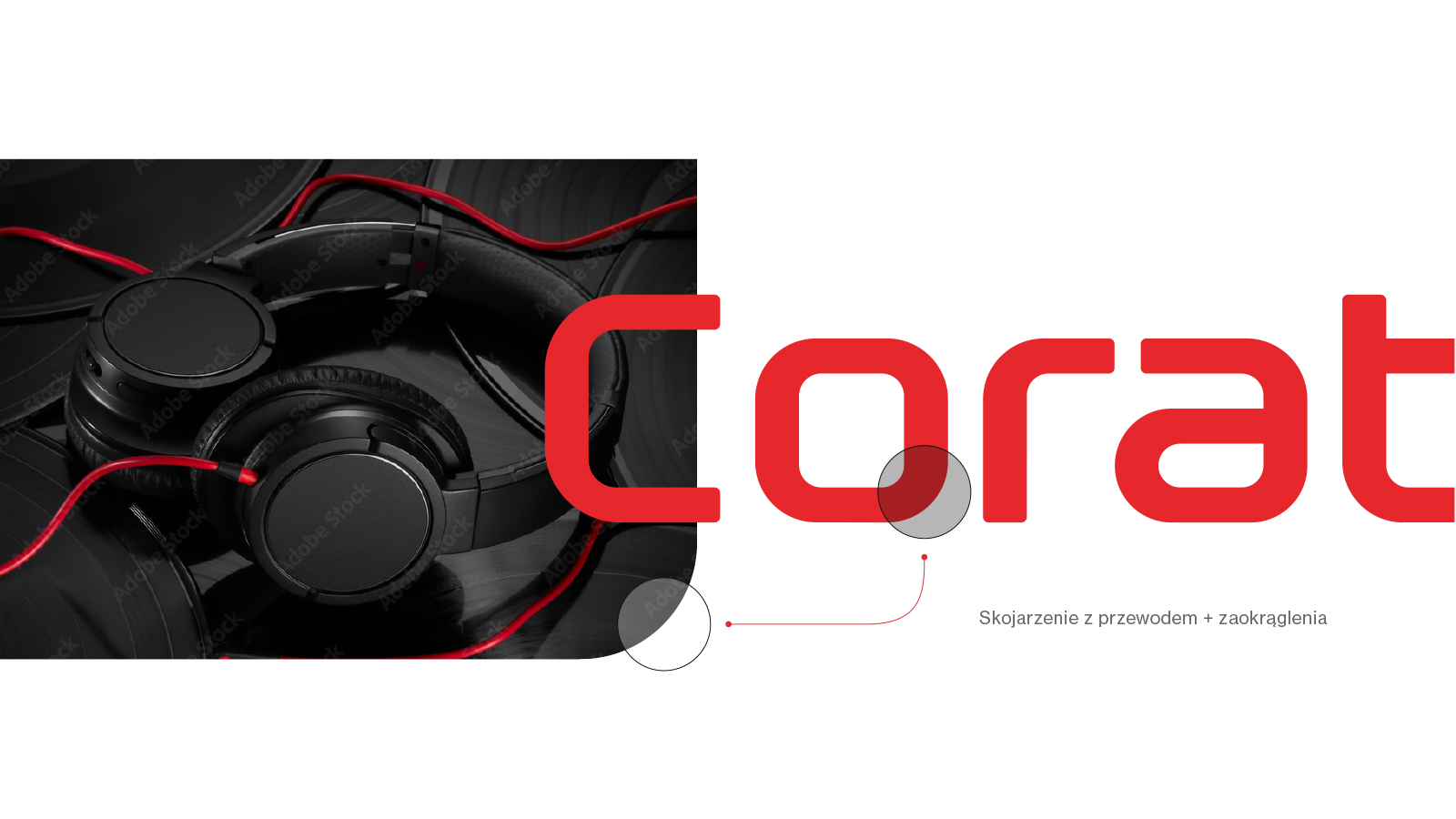
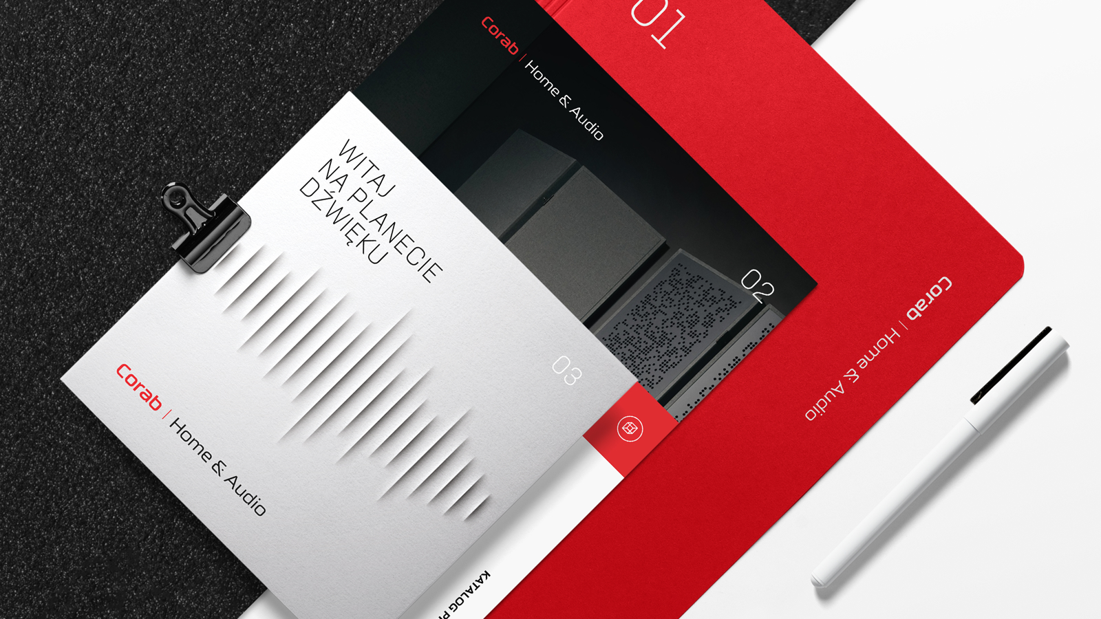
The refreshed visual identity combines a modern feel with professionalism. Thanks to consistent graphic elements, Corab gained a fresh look that reads clearly for new and long-standing customers alike.
Throughout the refresh we made sure the key aspects of the brand stayed intact. Its characteristic elements, the colour and the style among them, were modernised subtly so as not to lose the things that make the brand recognisable.
The new communication underlines the exclusive character of what Corab offers. Every detail of the visual identity is there to reinforce the brand's position as a trusted distributor of hi-fi equipment for the most demanding customers.


Piotr Kowalski, author of the concept
The project for Corab Planeta Dźwięku i Obrazu is an example of work at the meeting point of tradition and modernity. We had to refresh the brand without losing its character — a challenge we met thanks to good cooperation and an understanding of what the client needed. What pleases us most is how positively the new visual solutions were received by their audience.
Discover our powers
See our offer

 Step 01
