


 Menu
Menu


Warszawska99 - identity and brand concept
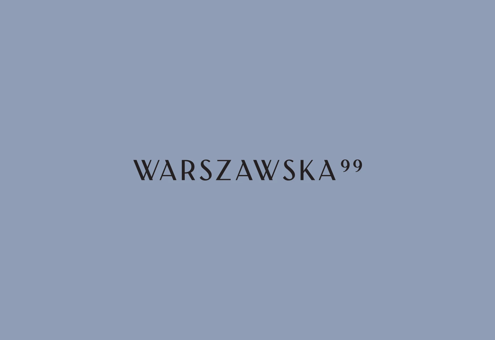
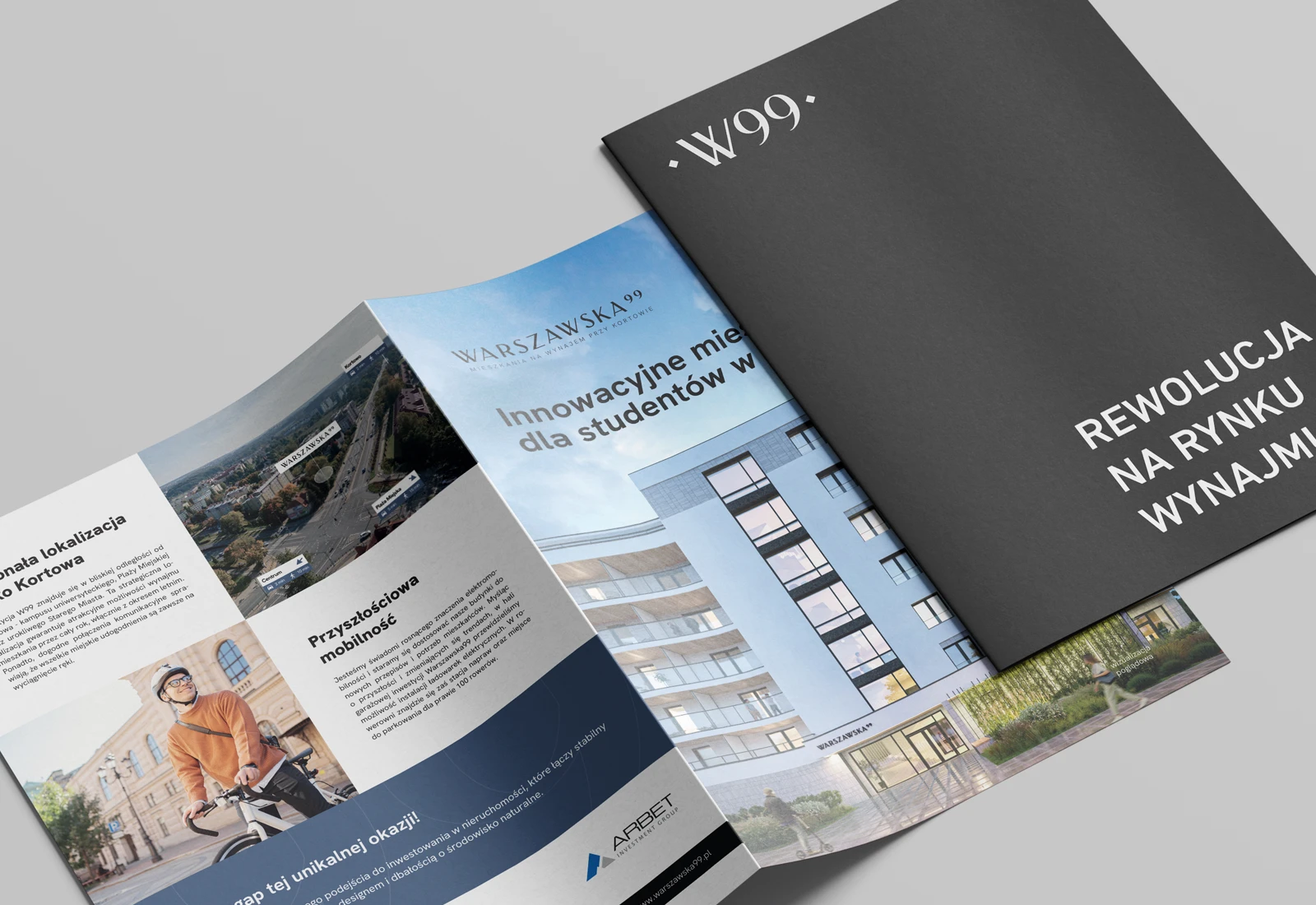
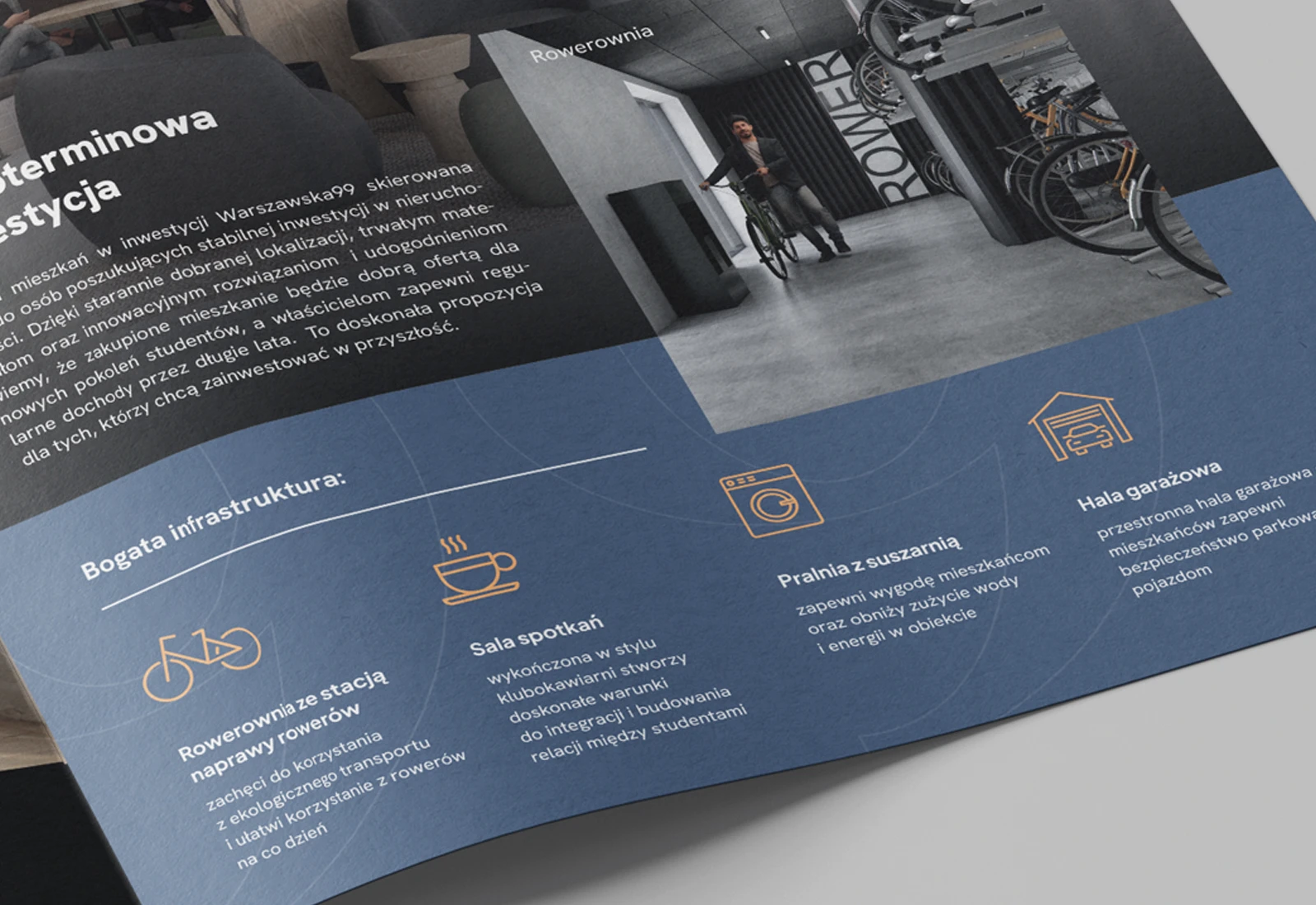
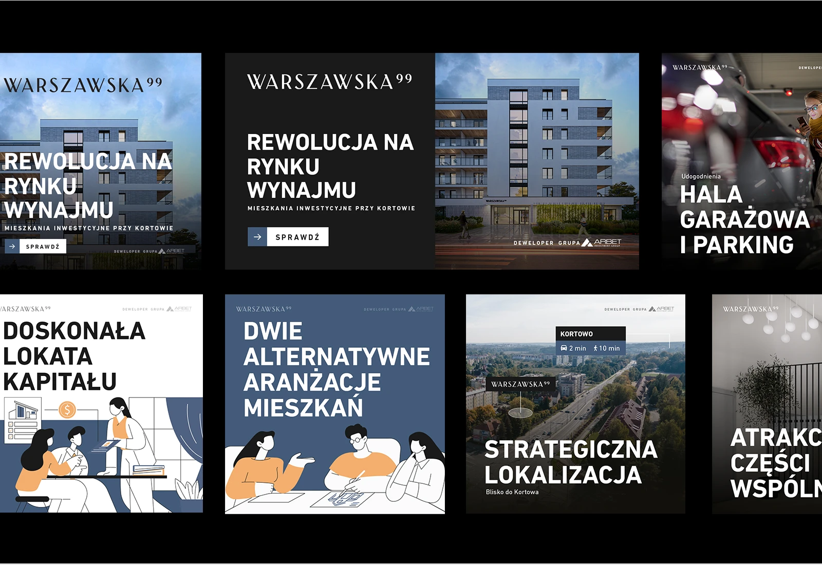
LogoWarszawska99 is another development by ARBET Investment Group, a developer we have worked with for years. This time our partner decided to bring an innovative offer to market, aimed at investor-buyers planning to purchase and then let the property.
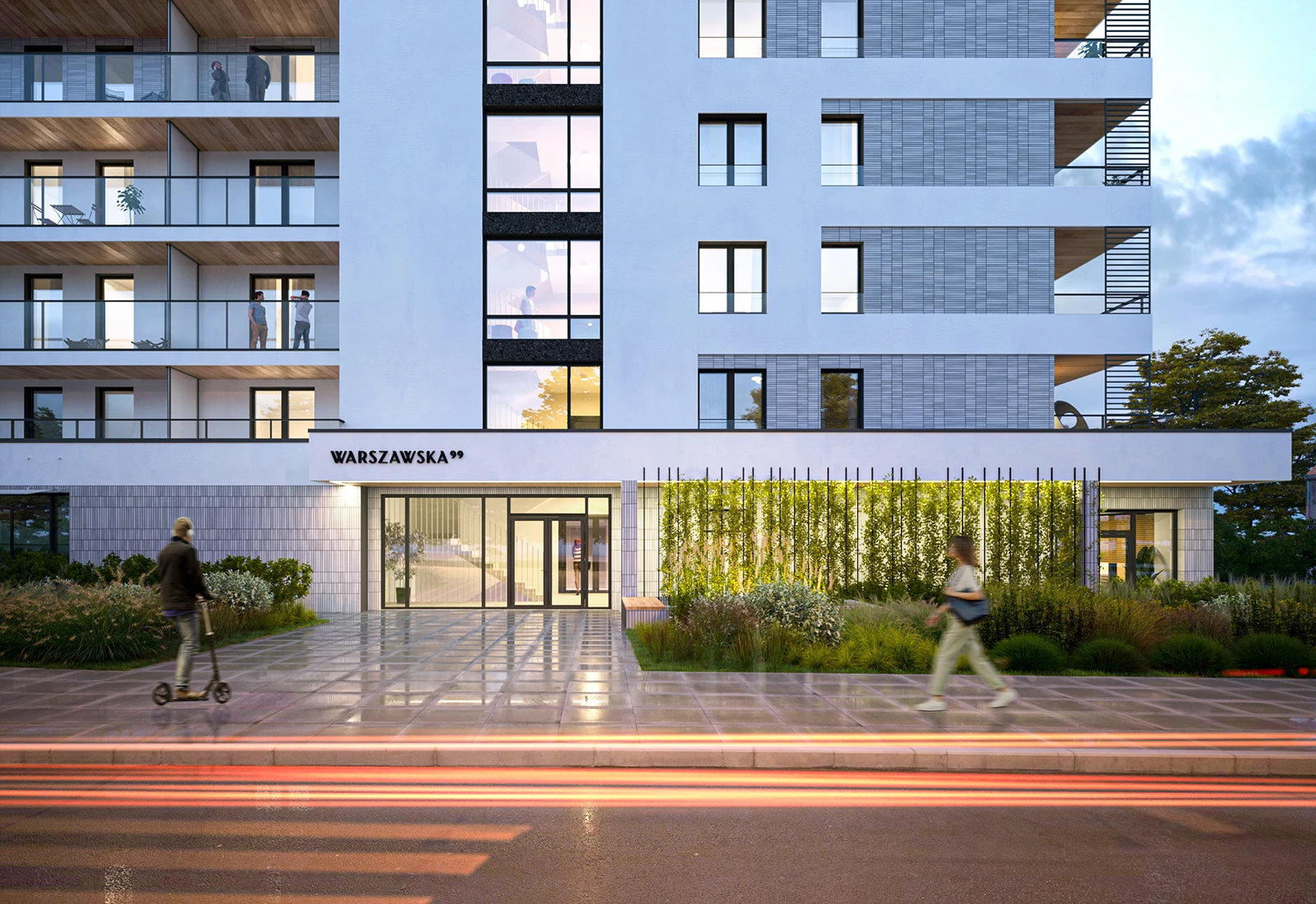
Sited between central Olsztyn and the Kortowo university district, the development was meant from the start to suggest modernity and functionality with a business edge.
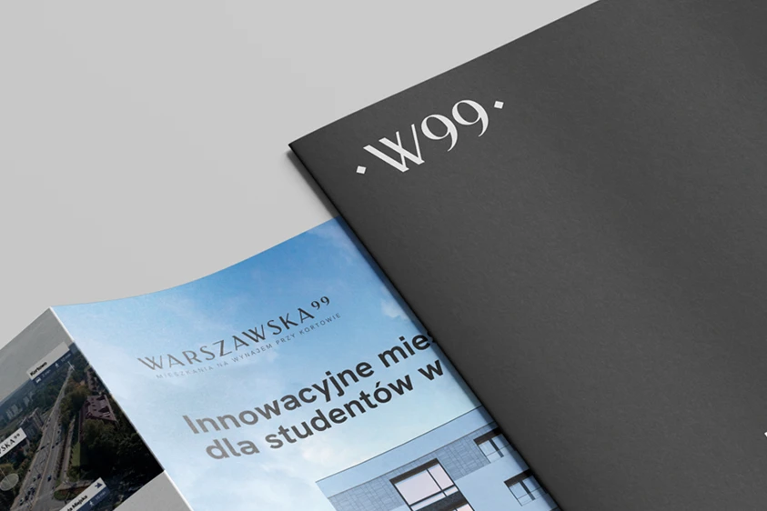


The name, the mark and the communication that followed were all meant from the beginning to suggest modernity and elegance alongside an urban character and functionality. We got there on every count.
Both the identity and the communication that followed had to be cut to reach an investor-buyer — someone informed, and often more sensitive to quality. The difficulty lay in balancing quality against approachability. The story the logo carried could not read as too exclusive, or it would have scared those investor clients off.
A flexible identity meant that in practice two names for the development came into use: Warszawska99 and the short form, W99. Each has its own distinct mark, coherent with the rest of the system.

Piotr Kowalski, author of the visual identity concept
Despite a relatively simple concept, the mark fitted the nature of the development beautifully, capturing its style, its character and its purpose. I was happy with the very first proposals we sent the client. The approval process for our concept went very smoothly too.
Discover our powers
See our offer
 Step 01
