


 Menu
Menu



Rolimpex Group - visual identity and brand concept
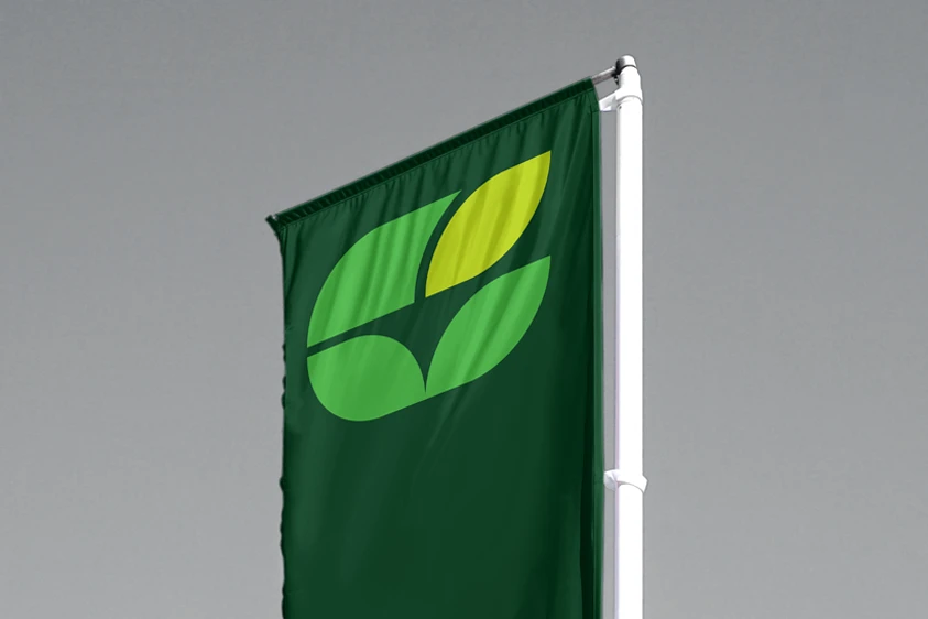
Logo“Three large companies with strong, established positions in their industry start operating under one banner, while wanting to keep their own brands.” Sounds serious, doesn’t it? How do you bring that together? How do you show a shared brand and bring out its complexity at the same time?
Appearances aside, it went rather smoothly. The very first of our proposals appealed to the client, and the mark and the other elements of the communication quickly became a fixed part of the narrative for each of the Rolimpex Group brands.
It is worth adding that the Rolimpex Group is a consortium of three large companies, leading producers of grass and agricultural plant seed not only in Poland but across Europe. The Group comprises Rolimpex (with the Najlepsze Trawy Z Iławy brand), Sowul & Sowul and Agronas.
year: 2023
customer: Grupa Rolimpex


The logo and identity of a parent entity for three significant companies could not be overwrought, and yet from the beginning it had to carry force and clarity. Keeping it simple while keeping the message from being obvious became the first markers for the concept work.
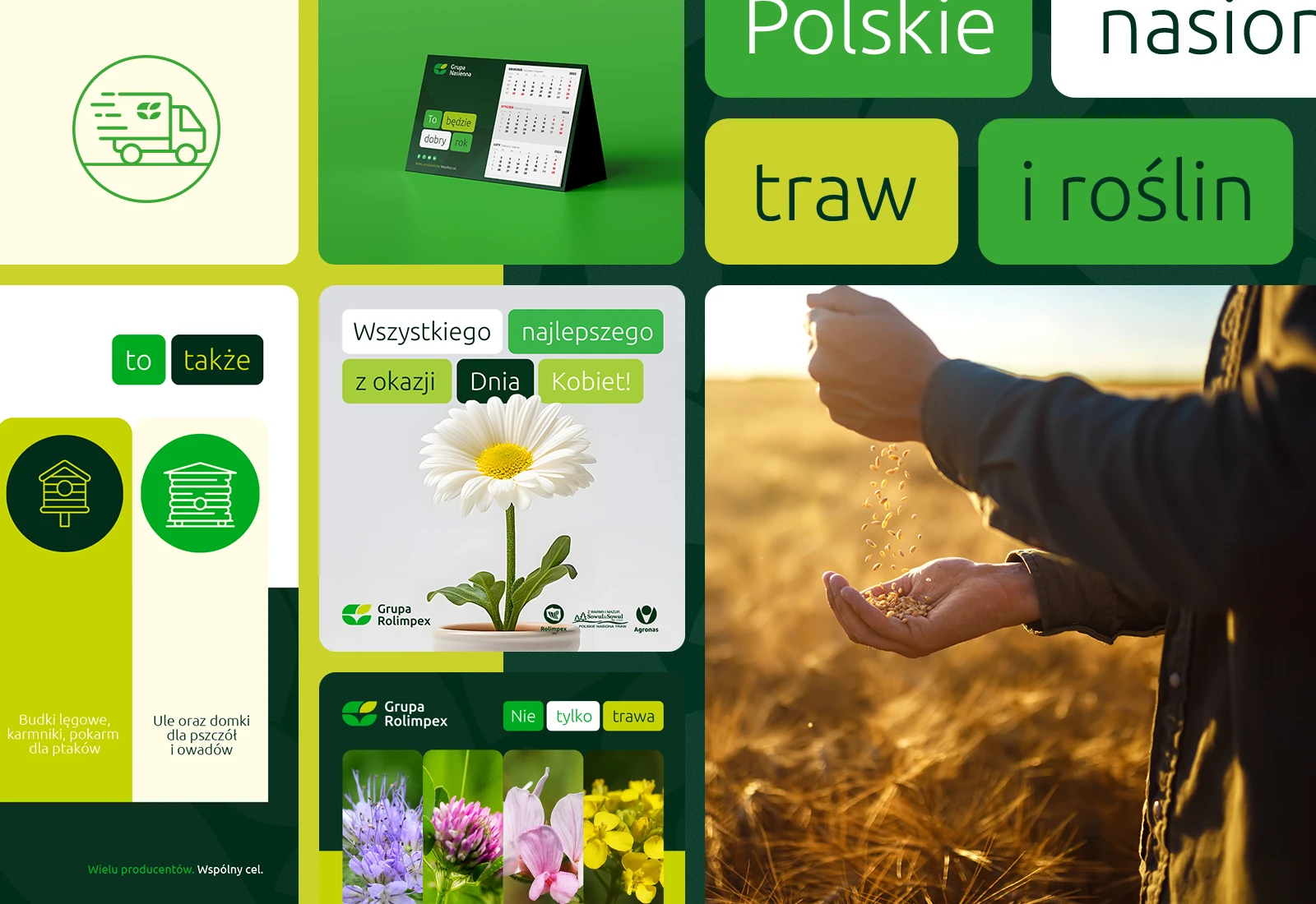
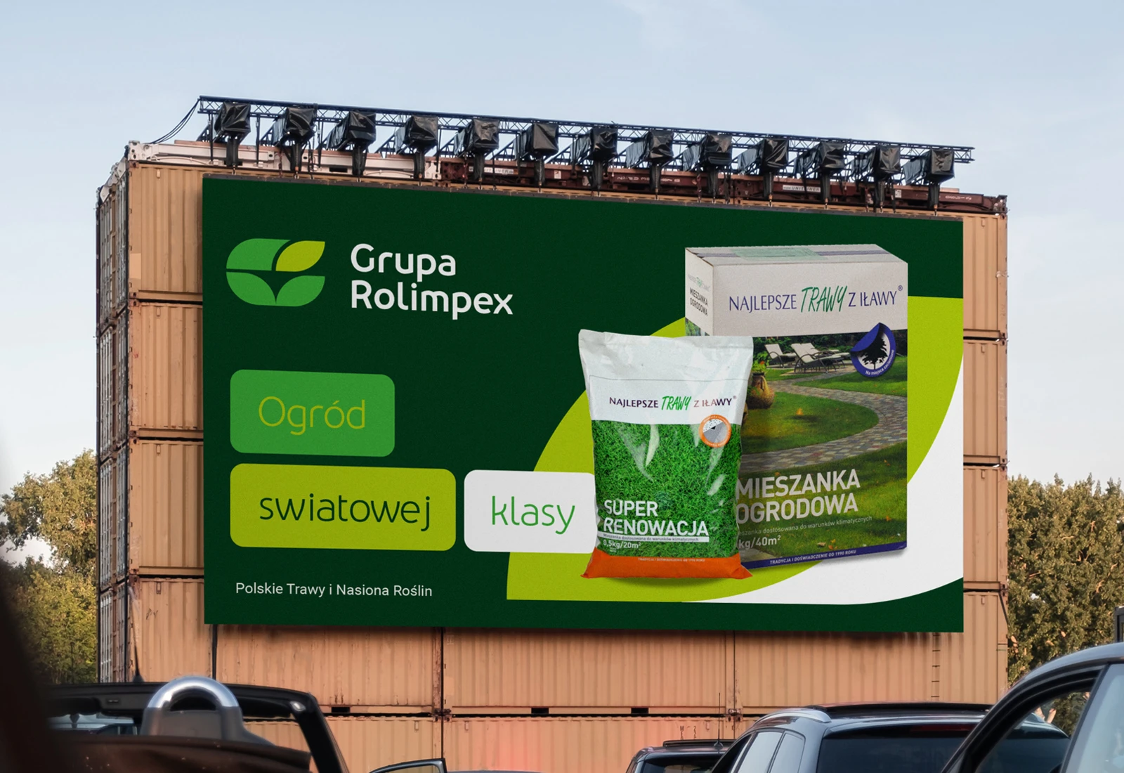
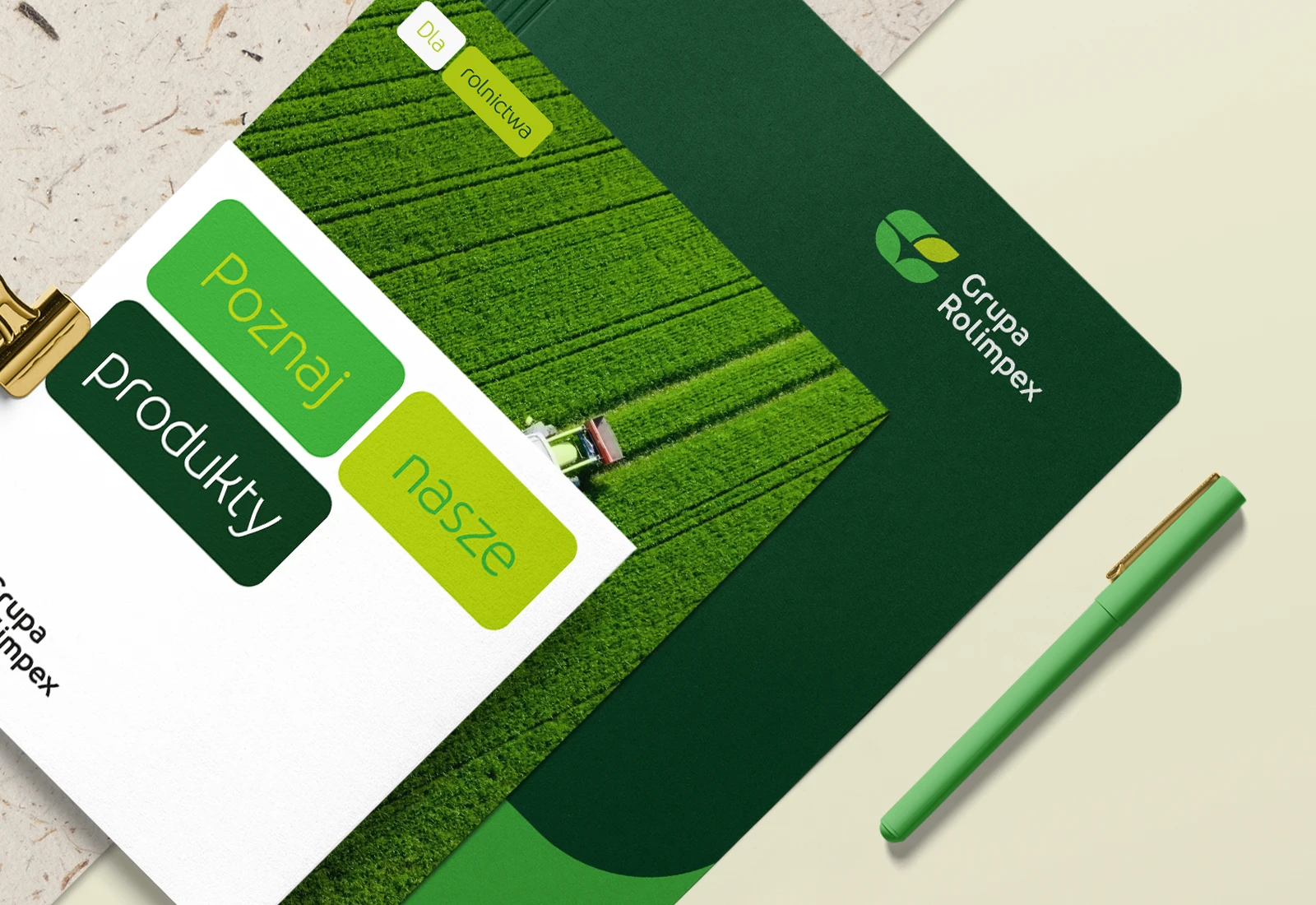
Another starting assumption was that the identity elements had to work in the communication of each individual brand and across many channels — social media, print, packaging. And not only in Polish, since the Rolimpex Group companies operate successfully in international markets. So the identity had to be universal and flexible from the very start.
The Group's international character and steady growth meant the whole identity, and the narrative that followed, had to be built for expansion and for scaling in several directions. From the beginning we had to account for the business goals and challenges defined by the industry and the market our client lives in.

Piotr Gajewski, managing director of renton.media
We knew the Rolimpex Group would become an important client, so we approached building the identity for this newly forming brand with deadly seriousness from the outset. We had to account for the complexity of the consortium and for the challenges the market poses, and will keep posing, to our client. That determination is what produced a logo and an identity that are highly flexible and open to scaling. Which is exactly what we and the client were after.
Discover our powers
See our offer

 Step 01
